Why creating UX friction can lead to a higher gift redemption rate: &Open’s unique approach to gift engagement
Not all UX should be seamless.
Deep dive into our categories
At &Open, we design our UX with one thing in mind: to create as much gift excitement as possible. Those interacting with our tool are either sending a gift or receiving it, and the way we see it, both parties should delight in the process.
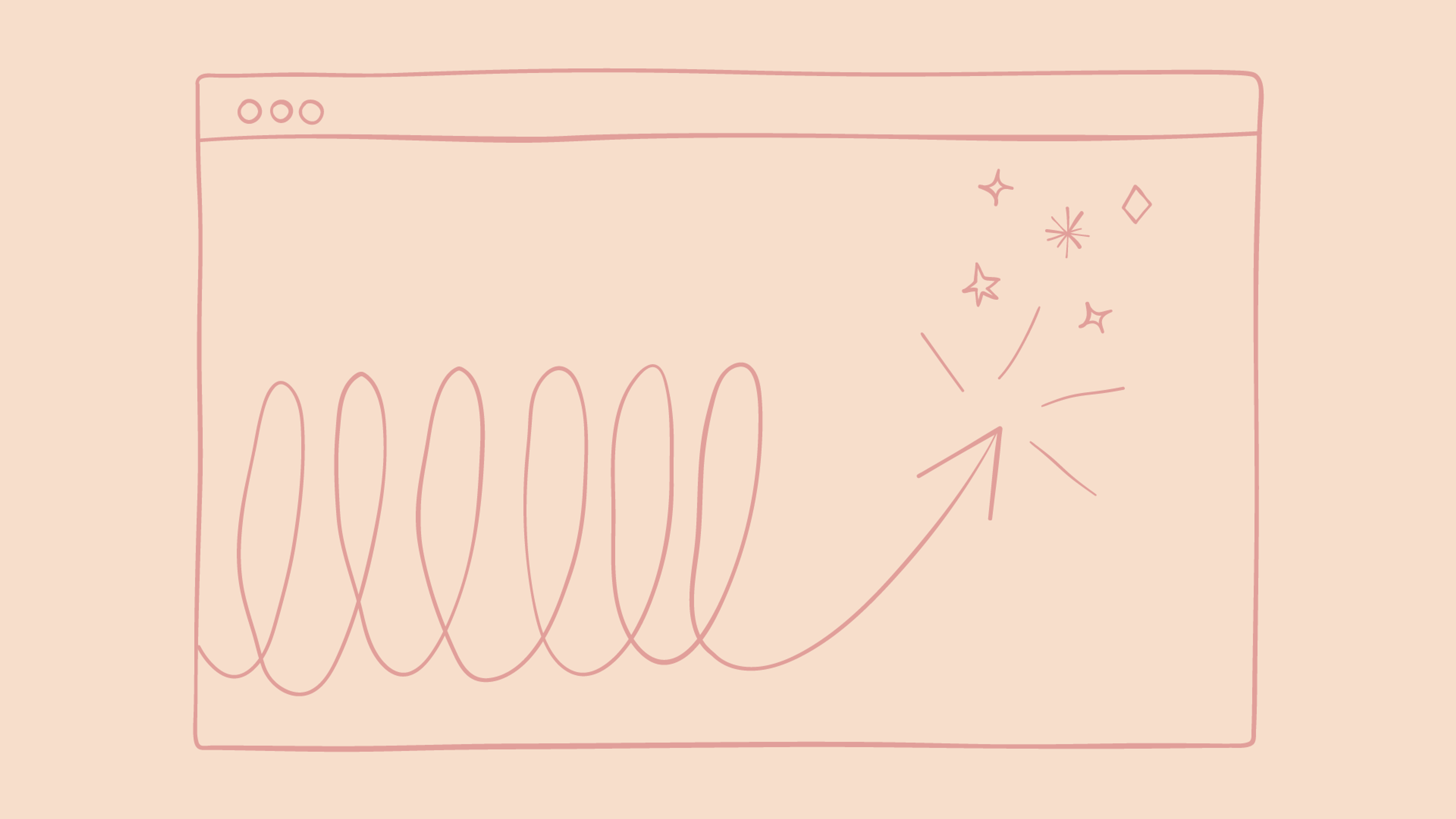
For us, the buzz word as our designers set to work creating our various paths, was friction. While this might seem counterintuitive, when everyone else is aiming to create the most seamless, frictionless UX possible - at &Open it’s about creating that extra bit of engagement with the tool before the ultimate payoff: the gift itself.
Gifting involves two parties: the sender (CS, CX or marketing agent) and the recipient (let’s call him John). On the agent side, the UX should be simple, seamless and ultimately encourage the act of giving. We've made these paths as frictionless as possible so agents—no matter what company they work for or where they are in the world—can send a gift or thousands of gifts in under 2 minutes. With ease, the gift invitations are sent, and then it's about the recipient and how they will receive their gift.
On the gift recipient side, there is more room to defy conventional UX. Receiving a gift is grounded in anticipation and has more potential for moments of pause and play. Hence, friction.
Scot Wingo
Everything today is built for speed and ease.
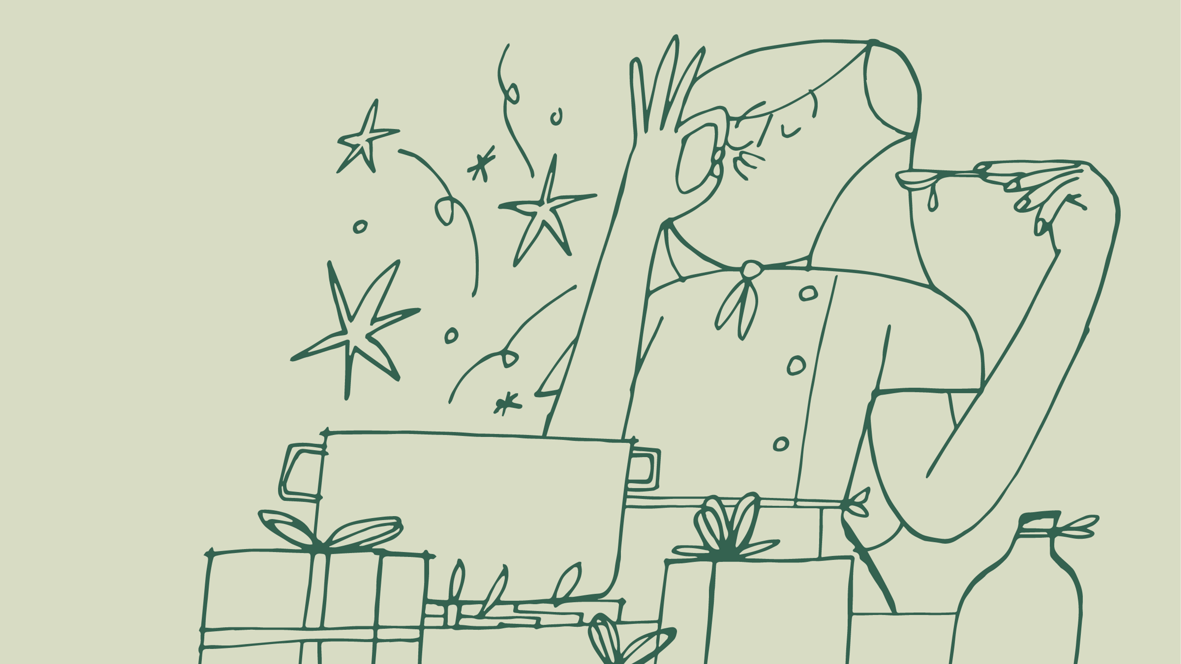
Why, then would we make the gifting process contrary to all of this? Because the act of getting a gift should be exciting and interactive, there should be some anticipation, a little pause before the final payoff. It should be more than a form to fill in. When John receives his gift invitation (pictured to the left) onto the platform, every interaction afterward should lend itself to—and build upon—this excitement.
Considering the tagline and objective of &Open "The World’s First Customer Happiness Platform" in the journey through the platform, the use of gift visuals like boxes and presents was a must. The usability of a platform has an opportunity to further push the brand narrative, and ours is one of care, of taking a moment to consider the act of giving.
Our designers set out to create a heaviness to objects, as well as the weight of gravity and collision.
The concept of the falling boxes was born from “surprise and delight”, which allowed the gift boxes to fall into the screen, land and bounce in an engaging and realistic way. The mouse itself gives every user the further thrill of flinging the boxes around the screen with varying speeds and effects. It is a concept known as gamifying: adding a game element to an area where it is not usually expected. It has no functionality. It is not seamless. It is however a moment of pause and a moment of play. It heightens the user experience using a combination of small details that make our UX unique.
So, what then is the ROI of creating friction in the digital gifting experience? A really high redemption rate. Our numbers highlight how—despite additional buttons and time—recipients like John enjoy interacting with the platform and complete the path. Proving that while *most* UX should be seamless, quick and easy - there are occasions that demand that little something extra to complete the experience. For us, the end result—the gift—warranted the panache and indeed, it continues to pay off.


Product
Solutions
Company
Resources
Legal
Contact Us
Follow Along